
You can normalize the most important browser differences just with a very short snippet …
Sometimes, when people talk about CSS resets or when I read something about known CSS reset snippets, I always catch myself thinking “Why is that a topic? Wouldn’t ever need that!”.
But if I’m honest, of course I use a CSS reset too. The thing is, it’s so very tiny and simple that I thought it’s not a topic and nobody would give it a name, publish it and write an article about it …
… well … I wouldn’t have … until now! In the meanwhile, I think it should be a topic because it’s so tiny and simple.
Keep Things Simple and Relevant
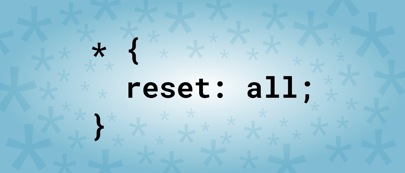
The tiny reset is actually very common in different variations but seldom mentioned. I guess because of its incredible simplicity.
* {
  margin: 0;
  padding: 0;
  font-size: 1em;
  font-family: inherit;
}

html {
  font-size: 62.5%;
}
The most relevant browser differences are space and font size. Therefore, we reset them first for all elements equally. With margin: 0 and padding: 0 we simply remove all spaces.
The font-size we can set to 1em or 100%, so each element inherits the font-size always from its parent. Because the browser default font size is usually 16 pixels, all elements on the website would inherit that value and would display text always in a 16 pixel size.
But there is a second font-size definition, that is passed to the html element. Its value could be .625em or 62.5%. To see what that would be in pixels, you only need to calculate 16 * 0.625 and you’ll get 10. Because the html element is the root element, all other elements will inherit this value and will display text now always in a 10 pixel size. That’s pretty small, but there is a good reason for it. I’ll go for it later.
Lastly, the font-family: inherit definition ensures, that everywhere the same font family is used, especially in form elements, where usually font-family not inherits. This is the only definition, that is not always needed, but easily forgotten.
There are other browser differences, but I think it’s good to keep things simple and relevant. Moreover, differences that are not covered with this snippet, usually need to be styled anyway. So a reset would be redundant. If an additional reset makes sense for a specific project, just add it for that project.
Performance of the Universal Selector
The CSS universal selector (*) has a bad reputation because of its performance and it’s a common opinion that it is a bad practice to use it at all. But that’s only partially justified. In fact it depends on the use case. For example .anyClassName * { … } would indeed be really slow. Just don’t use it in that way. But if the universal selector stands alone (* { … }), its actually really fast, so let’s use it.
Thanks to Harry Roberts at this point, from whom I learned this.
10 Pixel Font Size
So, why should it be useful to have a 10 pixel font size? If you already use relative units, which you should do because of accessibility reasons, the answer is pretty simple. It’s just easier to calculate with it. If you have a 10 pixel basis and you want to have a paragraph with a 24 pixel font size, you only need to write p { font-size: 240%; } or p { font-size: 2.4em; }. As you can see it’s only a point shifting, which makes the usage of relative units much easier.
That’s not only useful for font sizes, but for all size specifications, such as section { padding: 2em; }, which results in a padding of 20 pixels for section elements.
Just note that the point shifting technique only works if no parent element already got a font size definition that differs from 10 pixels. So, just define the font size always for the lower most element.
Thanks to Daniela Kerschbaumer, from whom I learned this technique.
Does this article help you?
If you want to help me too, just send me the amount this article is worth to you. It helps me move on and understand what people want to read the most ?
Conclusion
As you can see, already a very simple CSS reset snippet could be really useful. But keep things relevant, always adjust the snippet to your needs.
So, now I published my very own CSS reset, wrote an article about it, and now it’s time to give it a name … to make clear that it always should be adapted, let’s call it the eHtmlu reset basis ?
One of my next articles will cover a more modern and advanced technique to use relative units. So keep in touch.
If I was asked to recommend an other reset CSS I would name Eric Meyer’s or normalize.css, depending on the needs and preferences. While Eric Meyer’s erase all styles, normalize.css preserves useful browser defaults. But whatever you choose, I would always recommend to adapt them to your specific needs.

Thanks for mentioning me in this article! 😉
My pleasure! ✌?
I would also use
border-sizing : border-box;
too
Thank you! That’s a really good input. In the meanwhile I use this very often as well. ??
You mean box-sizing, I’m guessing.
OK, I want to include reset lines, but then after I can’t apply new CSS styles ! What to do now ?
The important thing is, that the reset lines need to be the very first CSS on your website. If that’s the case, you should be able to apply any new CSS styles.